Sunny Microschools Website || UX/UI Design
Overview
End-to-end UX/UI design for a microschool platform: stakeholder discovery, lean UX, information architecture, and responsive UI
Challenge
Design a website that builds trust quickly, explains a non-standard education model, and guides educators and parents toward inquiry without overwhelming them.
Target audience can be unfamiliar with the microschool concept
No existing brand trust
Multiple audiences (parents, educators, partners)
Goal
Reduce cognitive load around “What is a microschool?”
Establish credibility and safety for educators
Create a clear inquiry path
Support scalability for future schools
These goals were validated and refined through early stakeholder conversations.
My Role
Stakeholder communication and requirement clarification
Discovery synthesis and UX strategy
Information architecture and flow design
Content structure and hierarchy
UI design and responsive behavior
Launch support and handoff
Discover and Define
Context
Sunny Microschools is a newly launched education platform designed to help educators start and operate their own microschools, with parents as a secondary audience. The model is unfamiliar to many teachers considering entrepreneurship, and early stakeholder conversations revealed uncertainty around how to communicate feasibility, support, and next steps clearly and credibly on the website.
To align stakeholder goals with educators’ decision needs, I synthesized early conversations and assumptions into a lean UX canvas. This helped surface the key risks, concerns, and expectations educators have when evaluating whether starting a microschool is realistic for them, and clarified the priorities that needed to guide the site’s structure and content.
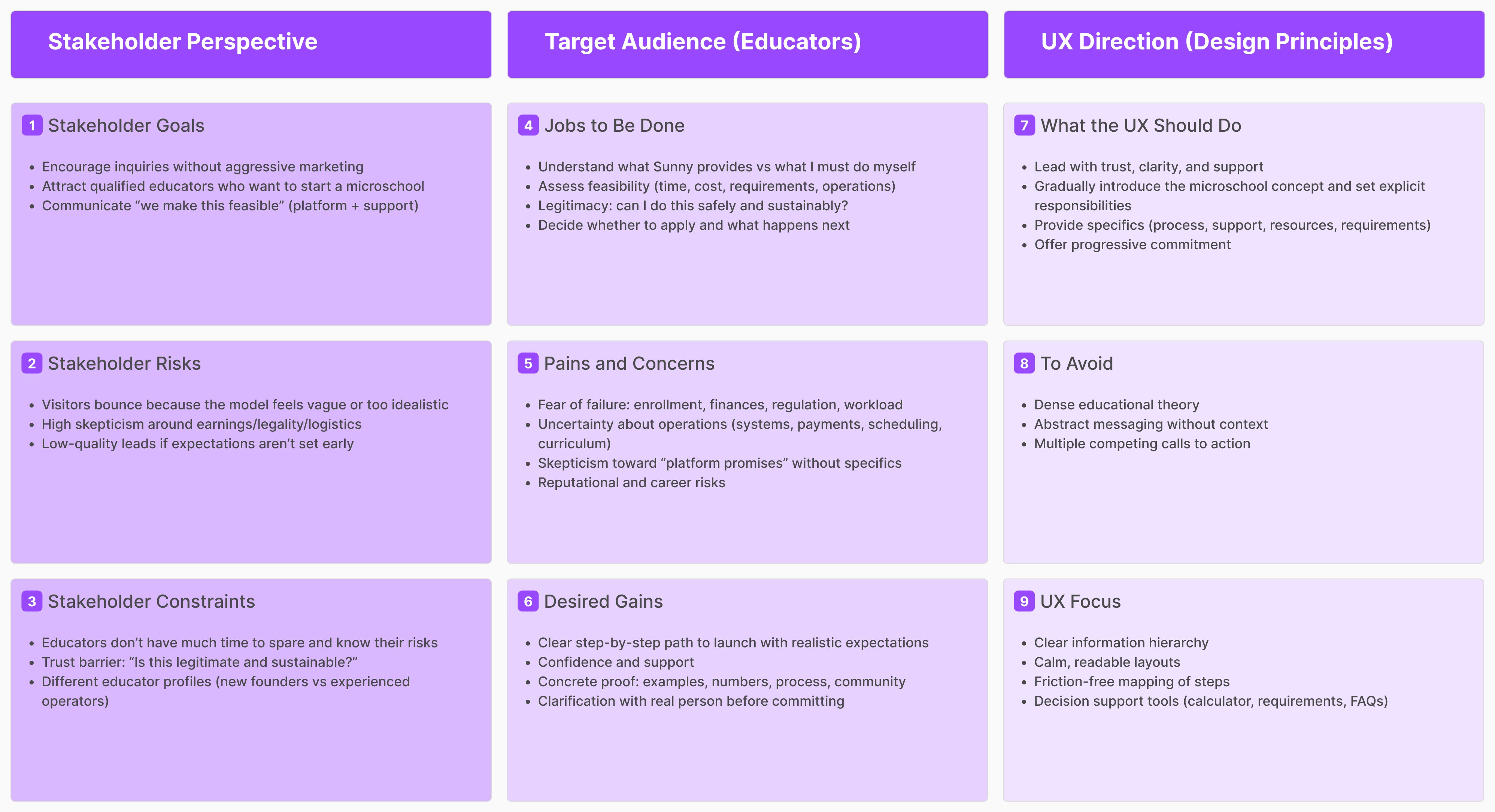
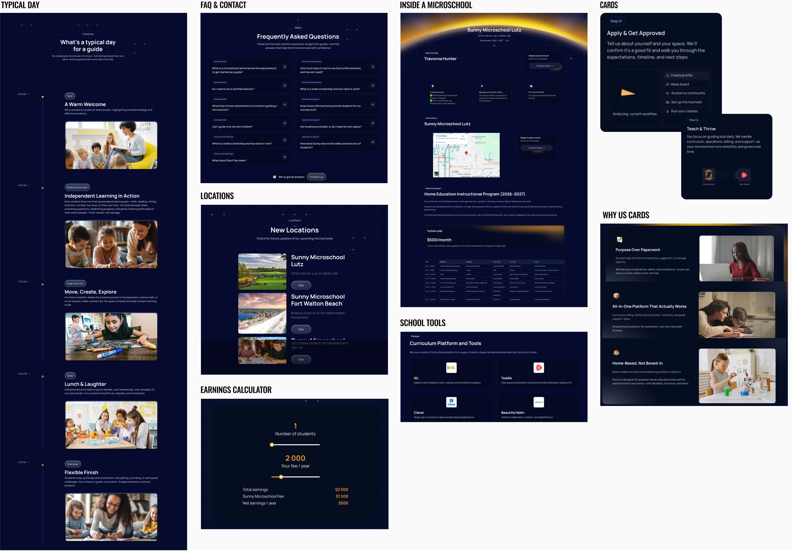
Problem: Educators experience high cognitive load and are often unable to commit thinking the process is too complex || Solution: map out progress in the information architecture
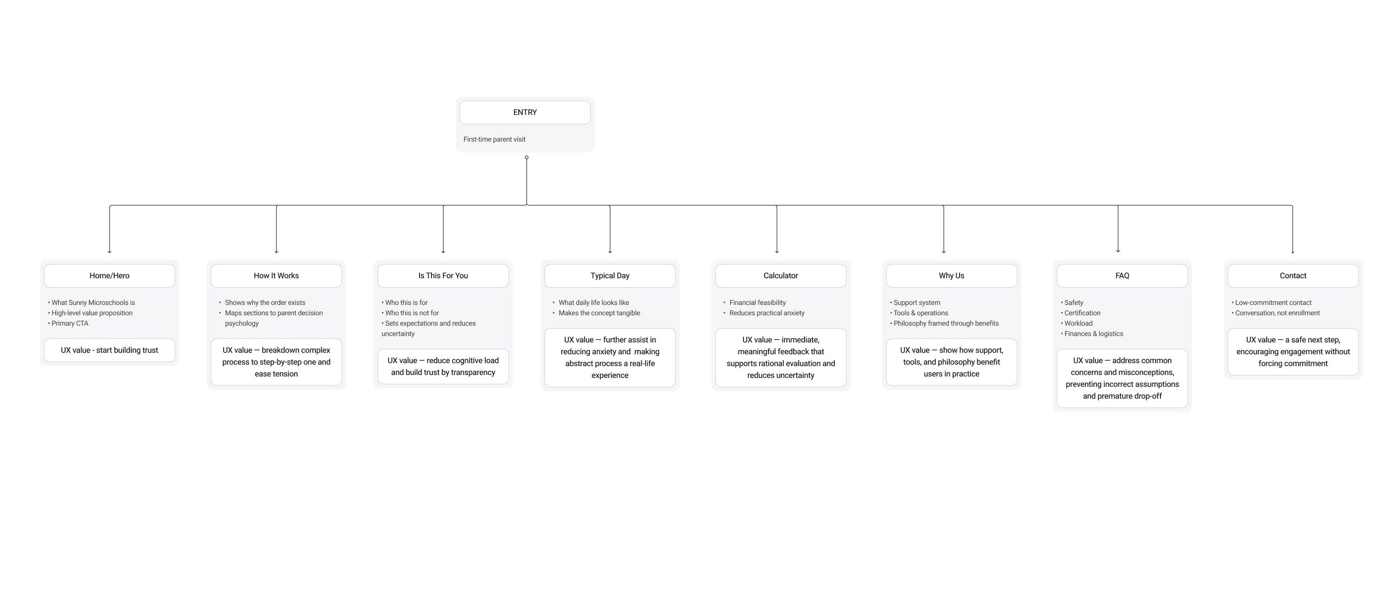
The canvas highlighted a consistent pattern: potential educators needed reassurance and context before they were ready to engage with detailed explanations or next steps. As a result, the site’s information architecture was designed as a progressive path — establishing trust first, then introducing the microschool model step by step, and only later guiding users toward a low-commitment inquiry.
What I Did
Based on the Lean UX canvas, I proceeded to make UX decisions and reflect them directly in the information architecture:
Educators need to assess fit early
"Is This For You?" section to support self-qualification before deeper engagementFeasibility matters more than inspiration
"How It Works" as a structured, step-by-step explanation of the launch path rather than diving into vision or philosophyAbstract concepts create uncertainty
"Typical Day" section translates the microschool model into a concrete daily experience for educatorsFinancial and operational risk is a key barrier
"Earnings Calculator" to boost decision-making before asking to commitTrust is built through clarity and specificity
"Why Sunny" and FAQs as reinforcement layers to leverage legitimacy, support, and expectations.Educators value low-pressure atmosphere
"Inquiry / Contact" at the end of the flow as a low-key next step, not an early conversion push
Develop
In the Develop phase, I focused on showing a small number of high-impact UX decisions that most strongly influenced educator confidence and progression through the site.
Educators need to quickly understand whether the model fits their experience, motivation, and constraints before investing time || UX Solution: Place a clear self-qualification section early in the flow
Enables early self-assessment and reduces uncertainty
Sets expectations by clarifying who the program is and isn’t for
Builds trust through transparency instead of persuasion
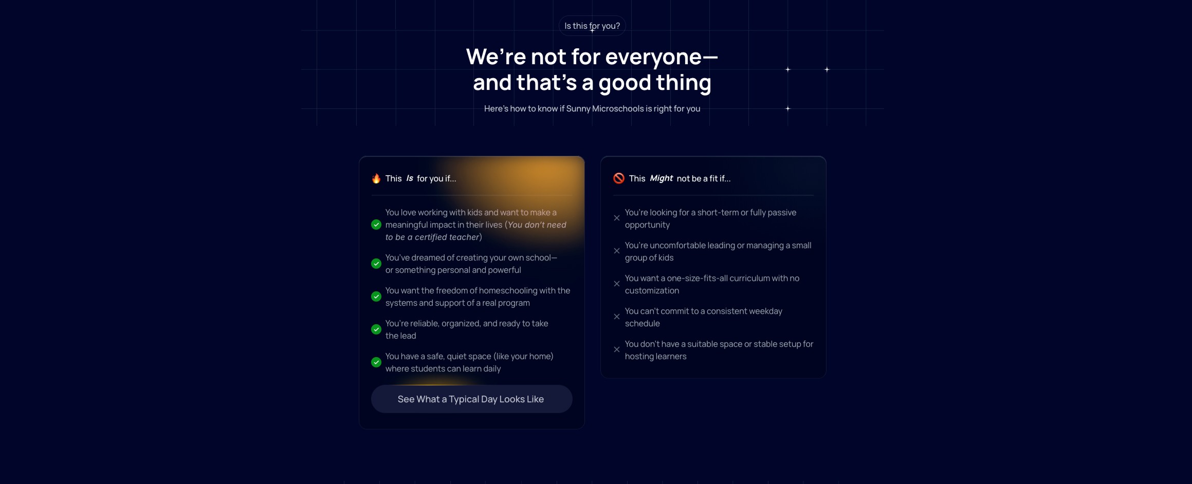
By answering “Is this relevant to me?” upfront, educators are more prepared to engage with detailed explanations later.
Educators evaluating entrepreneurship prioritize clarity over vision or philosophy || UX Solution: “How It Works” section as a step-by-step launch path
Breaks a complex process into predictable stages
Maps actions to outcomes, reducing cognitive load
Reinforces feasibility instead of abstract promise
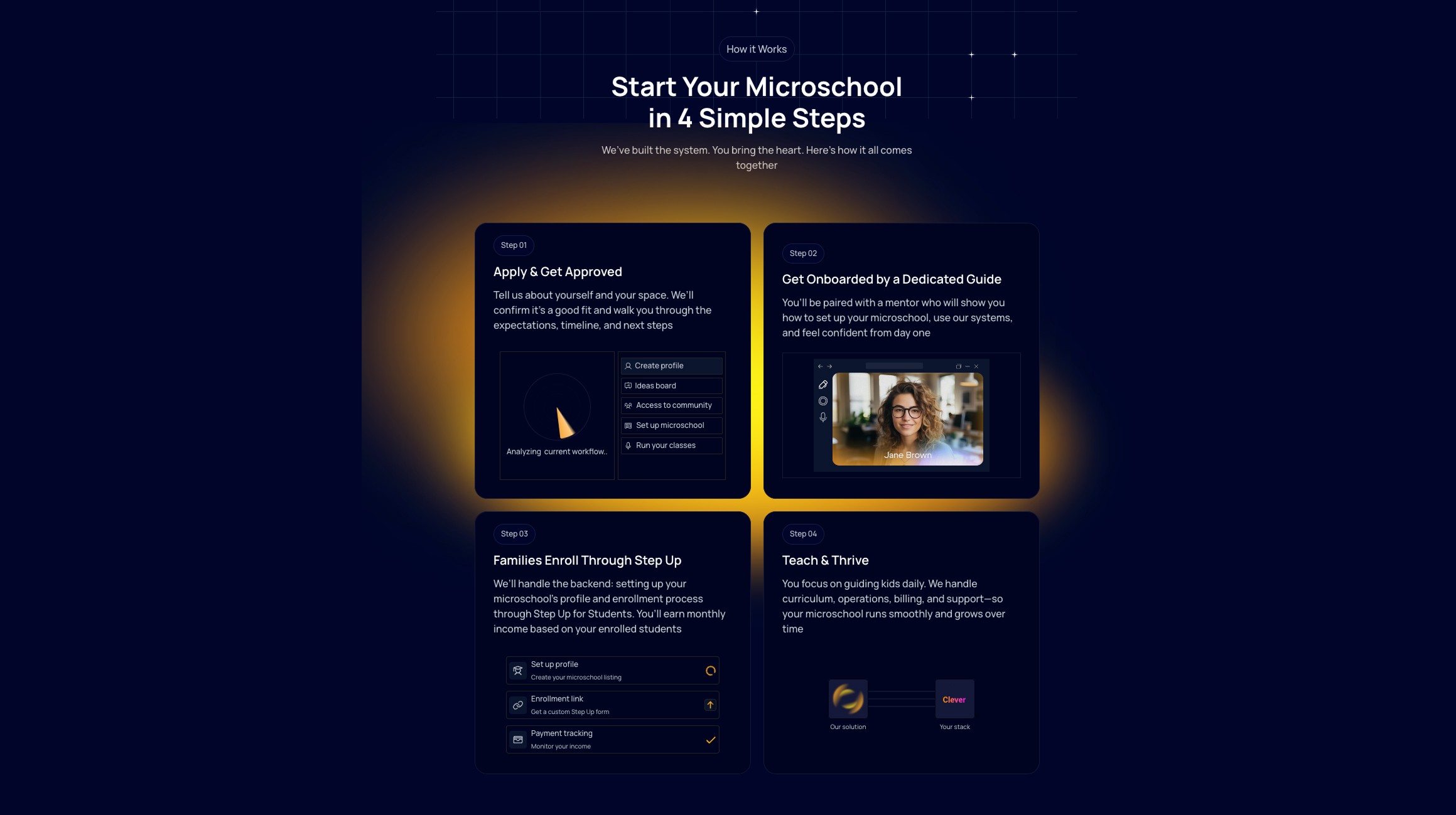
A clear process helps educators mentally model the journey and assess whether launching a microschool is realistic for them
Financial and operational risk is a major barrier to starting a microschool || UX Solution: Introduce a calculator before any thought about commitment
Supports rational decision-making with concrete inputs
Reduces anxiety by making outcomes more realistic
Allows to explore without pressure to commit

Providing financial clarity early increases confidence and leads to more informed, higher-quality inquiries
These decisions prioritize clarity, feasibility, and low-pressure progression, reflecting how educators evaluate unfamiliar but high-commitment opportunities.
Design (Prototype)
Outcomes:
Designed the experience around how educators actually make high-commitment decisions, not around marketing patterns
Focused on clarity and feasibility first, using structure and progressive disclosure to reduce uncertainty
Supported decision-making with concrete signals (process, daily reality, financial considerations) before asking for contact
Kept the inquiry flow intentionally low-pressure to encourage informed, confident conversations
Tools
Figma
FigJam
Framer