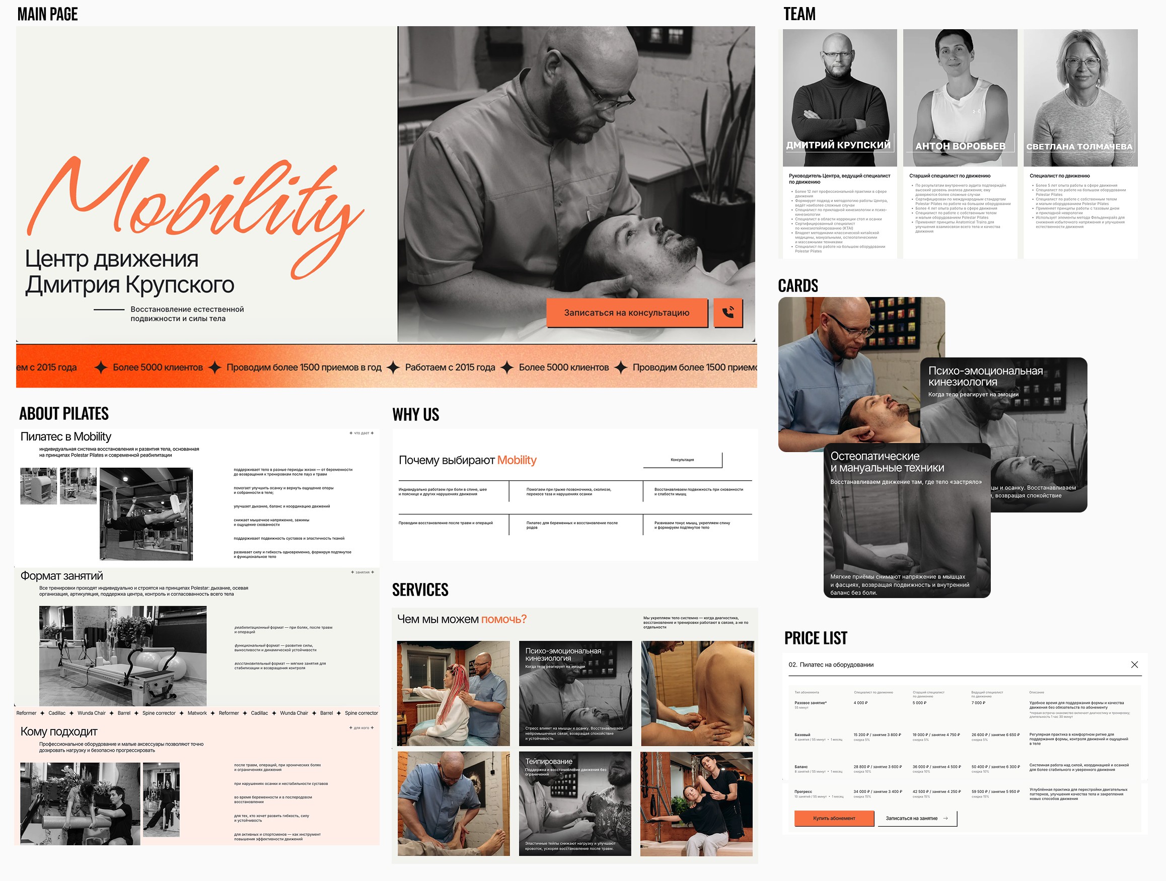
Mobility Center || Unified Experience for Movement and Recovery
Overview
Mobility Center combines kinesiology and Pilates to help clients restore function and move better. From the outset, the client emphasized that the combined approach is both the center’s main advantage and its biggest communication challenge.
The task was to design a landing page that presents both disciplines as one cohesive experience, not as separate or competing services.
Challenge
Kinesiology and Pilates address similar movement problems from different angles, but are often perceived as unrelated or even conflicting. Presenting them separately risked creating confusion, while over-explaining the methods risked overwhelming users.
The challenge was to unify both disciplines under a single, intuitive narrative that feels natural, professional, and easy to understand.
Goal
Present kinesiology and Pilates as one integrated movement system
Help users understand what the center can help with before explaining methods
Build trust through clarity and a professional, calm tone
Keep navigation simple with a clear path to inquiry/booking
My Role
Stakeholder communication and requirement clarification
Minimal UX strategy for building a cohesive experience
Content structure and page hierarchy
UI design and responsive behavior
Development handoff and launch support
Discover and Define
Context
Before moving into structure and UI, it was important to understand why combining kinesiology and Pilates is difficult to communicate on a single page and what would make that combination feel clear and natural.
People come with a specific movement problem, not with an understanding of kinesiology or Pilates (they often even don't know what those are)
When presented as separate services, kinesiology feels clinical and Pilates feels fitness-oriented, which can create confusion instead of clarity
Early conversations and a short user survey confirmed that people want to understand what the center can help with and what will happen next, before choosing an approach
Because this is body-focused work, trust and clear structure matter more than detailed explanations of techniques.
Design goals
Present kinesiology + Pilates as one movement system with different tools — not a split offering.
Keep the experience simple and scannable, with depth available where it matters.
Build trust through specificity (what happens, who’s responsible, what problems are addressed), not marketing language.
Make booking feel low-friction and consistent with the “professional but friendly” tone.
Key principles
Outcome-first, method-second: start with what we help with, introduce modalities after relevance is clear.
One narrative spine: everything supports the same concept—restoring function through movement.
Calm hierarchy: readable structure, predictable sections, minimal visual noise.
Develop
Unifying frame: “Movement Center” first, services next || Supports rational decision-making with concrete inputs
Decision
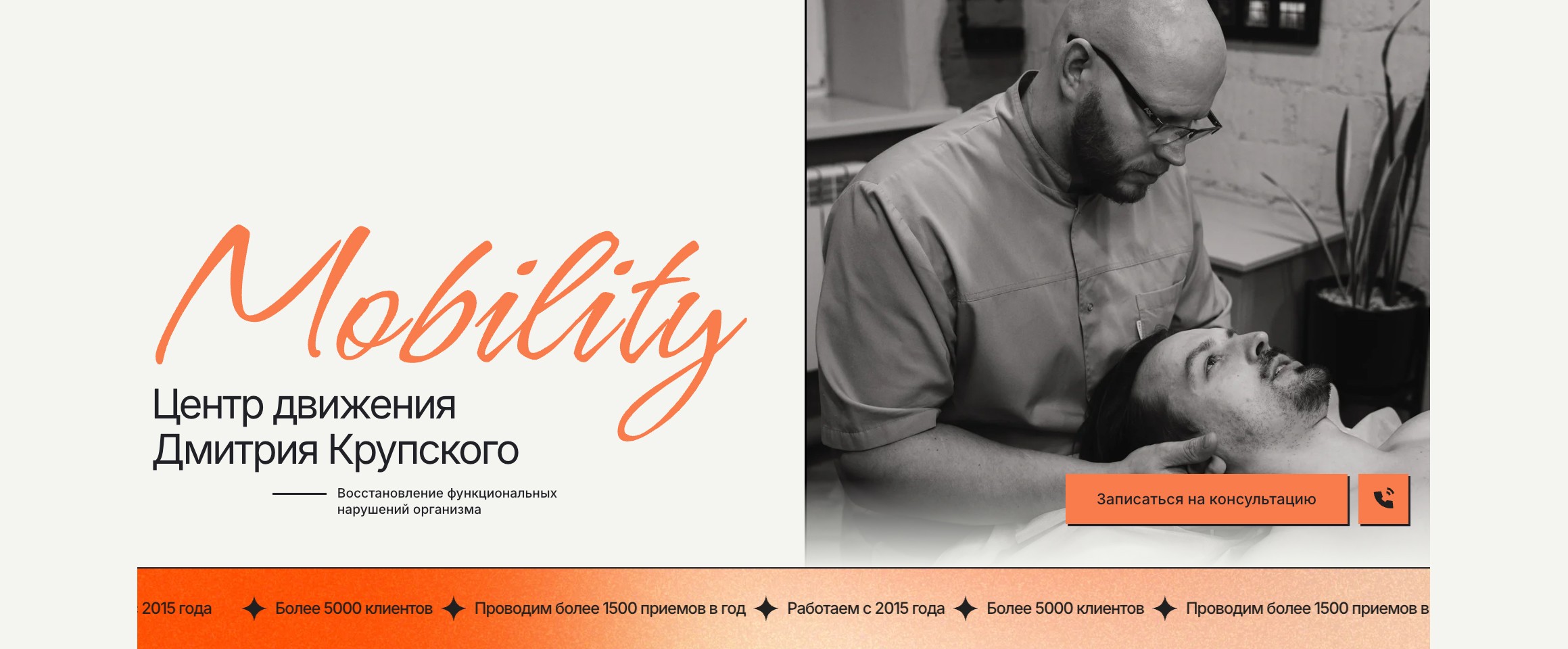
Lead with the idea of restoring function through movement (“Mobility Center”), instead of presenting Pilates and kinesiology as two parallel tracks.
Why
This removes early decision friction (“which one do I need?”) and gives users a simple mental model: one place, one goal, multiple tools.
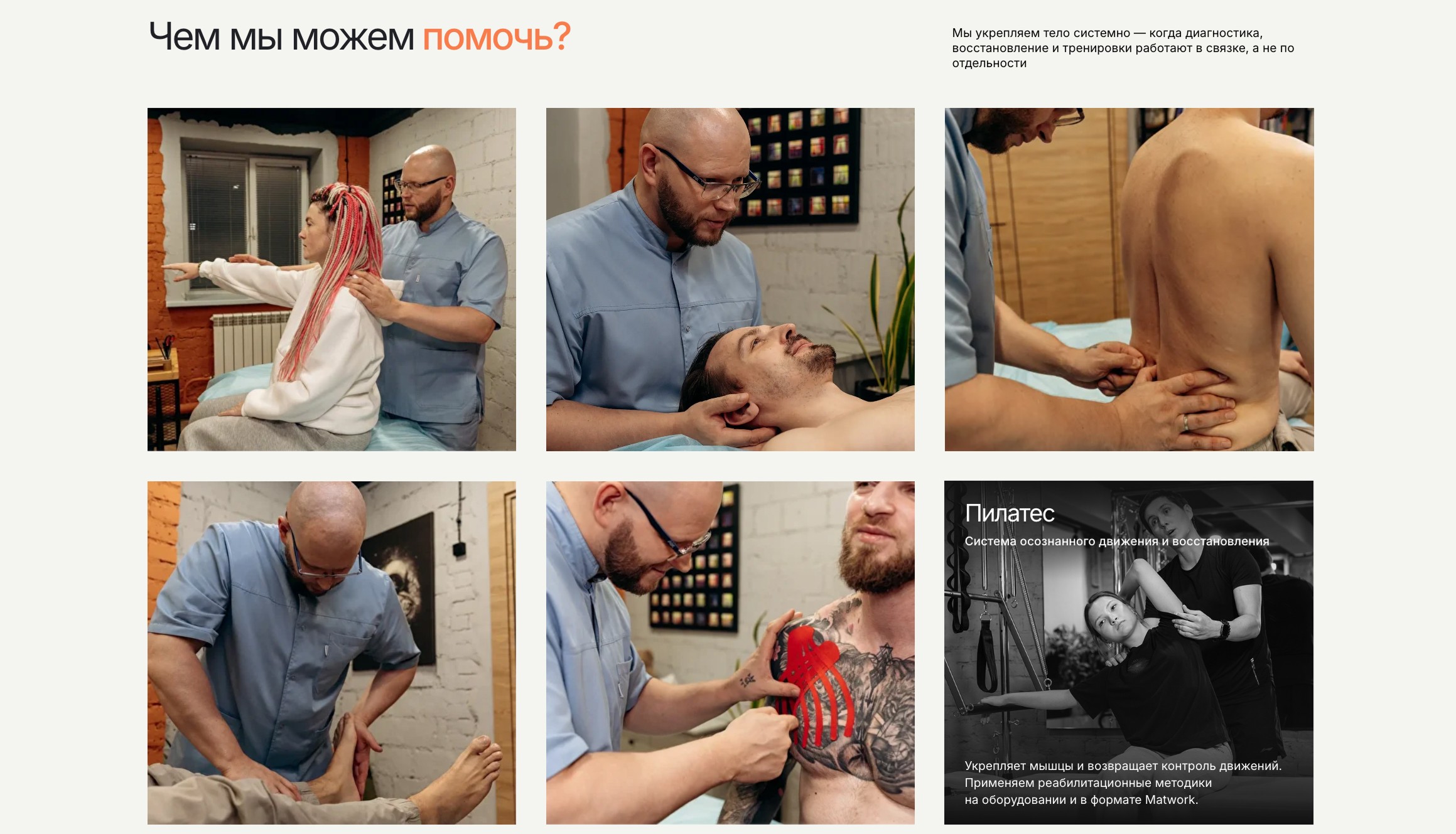
Problem-to-solution mapping: “How we can help” cards
In development, I focused on three structural choices that make the combined offering feel natural.
Decision
Use scannable cards to anchor the page in user problems and outcomes, with Pilates positioned as one of the ways to restore and strengthen through conscious movement.
Why
This is the bridge between disciplines: users start from their issue, and the site naturally introduces the right combination of methods.
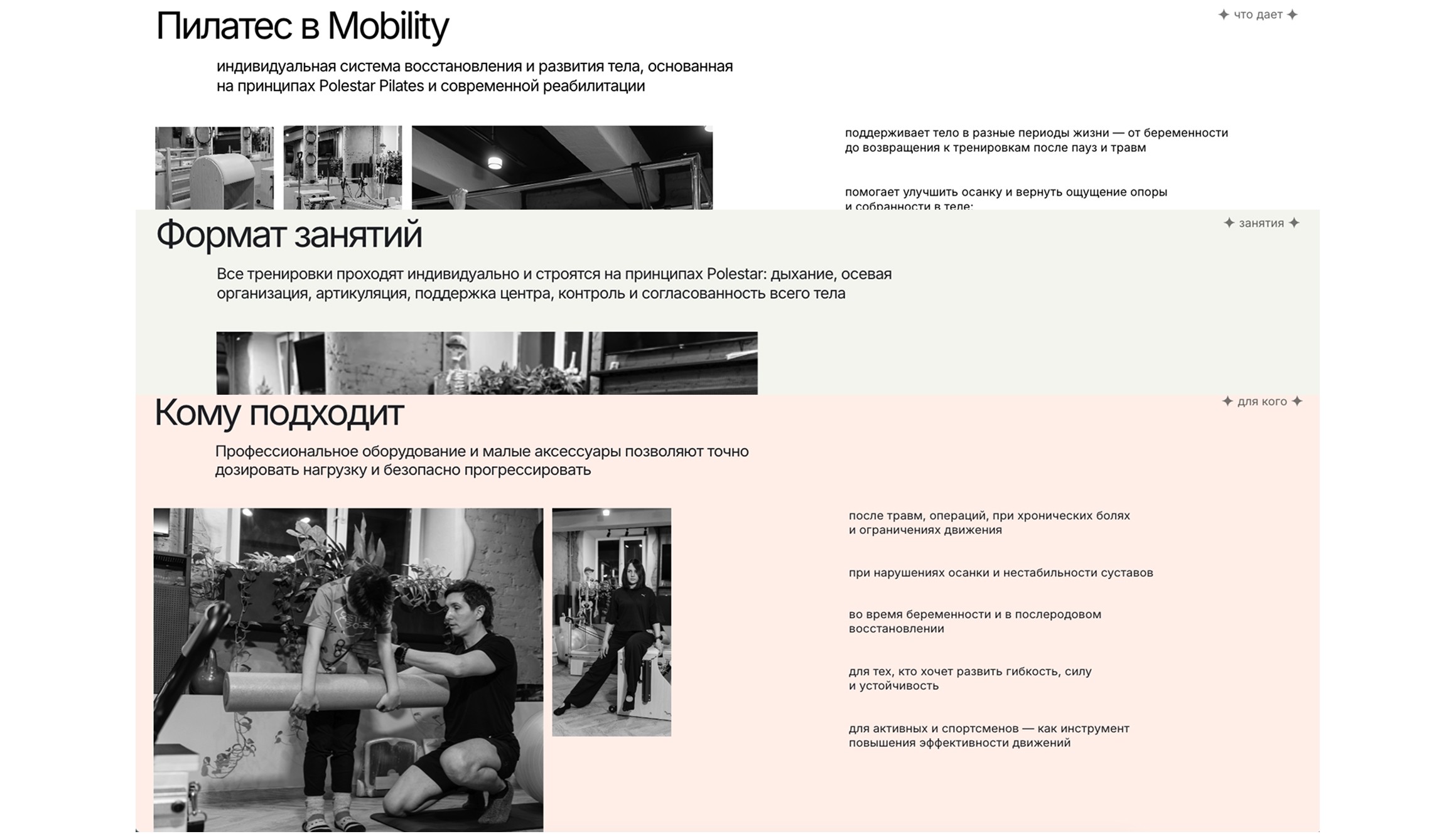
Controlled depth: a dedicated Pilates layered block (without breaking cohesion)
Decision
Include a dedicated Pilates section to explain how it works, what it helps with, and the equipment — but only after the unified narrative is already established.
Why
Once users accept the “movement system” framing, they want specifics: safety, format, equipment, and expected outcomes. This adds legitimacy without turning Pilates into a separate “product page.”
Design (Prototype)
The UI that speaks out:
Hero / page title
The page is framed as a Mobility Center, not as a Pilates or kinesiology studio. This establishes a single purpose — restoring movement — before any methods are mentioned.Introductory copy and section sequencing
The opening sections focus on movement, recovery, and body function, avoiding early references to specific disciplines. Users understand what the place does before how it does it.Problem-focused cards (“How we can help”)
Services are introduced through user problems and outcomes, not through method names. Pilates appears as one of the tools within this system, not as a standalone offer.Delayed method explanation
Pilates is explained in detail only in a dedicated block further down the page, once the unified movement concept is already clear.
Outcomes:
Presented kinesiology and Pilates as one coherent movement experience, rather than two separate services
Reduced confusion by framing the offering around movement and recovery
Made the combined approach feel natural and credible, without over-explaining methods.
Maintained a calm, professional UI that supports trust and easy decision-making
Delivered a clear, scalable page structure aligned with the center’s long-term positioning
Tools
Figma
Tilda